Interesting things I saw at the 2024 LA Times Festival of Books
It was wonderful to escape Minnesota for a few days and visit the LA Time Festival of Books. Running my own business and working from home means I like to leave the house a few times a year in search of inspiration for my professional design work, and to see what’s fresh and exciting in the world of IRL book marketing.
Here are the most interesting things I saw at the 2024 LA Time Festival of Books.
1. Gorgeous book cover designs are everywhere
I’m sure my jaw dropped when I saw the cover for Kaveh Akbar’s Martyr! at a booth several yards away from where I was standing. The bold two-tone design & the classic font make this cover look like a print you’d hang in your living room. Absolutely stunning.
In a sea of books with darker colors (which all have beautiful designs as well), Martyr! just stands out so much more thanks to its bold and bright palette.
I also LOVED this booth that had all vintage romance novels. It’s always a treat to see a curated genre collection like this.
2. Promotional bookmarks with QR codes—and way too much text
There were lots of bookmarks handed out as promotional material at the festival. They all had QR codes on them, leading to their own website or directly to a store to purchase the book—very smart!
However, a lot of the bookmarks had entirely way too much text. I’ll be frank—it’s a problem to stuff every single marketing idea you’ve ever have onto a small piece of material.
You think you want to give a potential new reader all the information about your book and story. But to be honest—people aren’t reading all of that. That’s why a lot of iconic advertisements and slogans are very simple, short, and to the point.
Learn how to edit and simplify your DIY marketing materials. Take a look at ads in good magazines and note the ads that caught your eye. I also like to draw design inspiration from movie title cards—they’re often so simple, yet so striking.
3. Let’s relax with the hard sell at a book festival
There were a few stands I walked by where folks were immediately pitching me their book and even outright asking if I and others around me were going to “do this” and buy a copy. Yikes! Be cool, man.
There’s no greater shopping experience in my mind than leisurely browsing at my own pace. The second someone tries selling me something unprovoked, I’m ripped out of my little world where I’m reading the back cover copy, contemplating who I could buy this for as a gift, and so on.
Not only is a hard sell annoying, but it comes off as desperate—which is never where you want to be when building your brand and a potential new community of readers.
I noticed that the people I ended up buying books from were the ones who I had a natural, personal conversation with. That kind of personal connection is what makes people want to support you and buy from you. Maybe that’s just my style—but I’ll bet a lot of other people are like me too.
I walked about 20 minutes away from the festival for lunch and stumbled upon a Michelin star counter service seafood restaurant called Holbox. It was by far the best fish taco I’ve ever had.
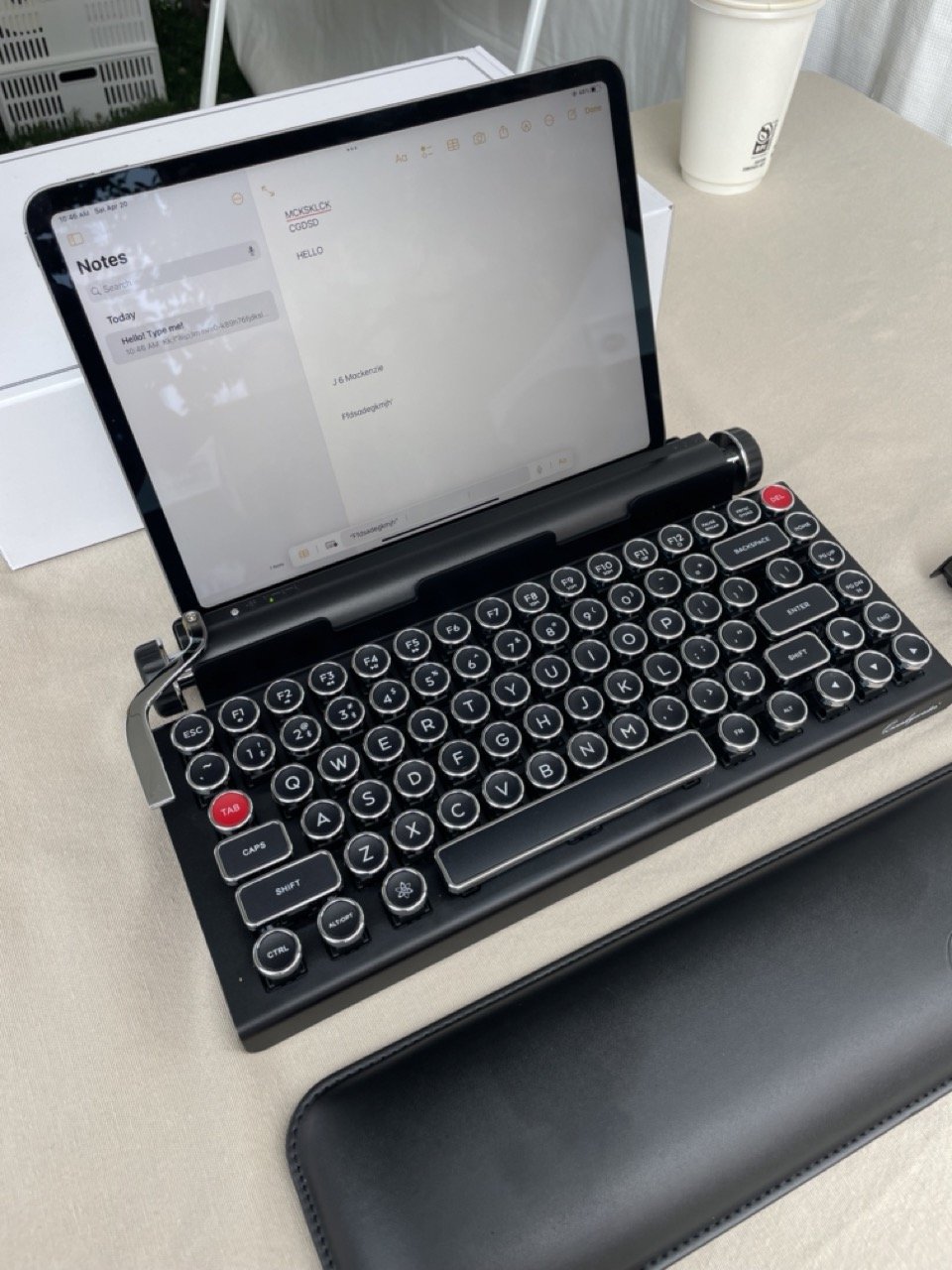
This was a cool wireless keyboard that had keys like a typewriter.
After a perfectly sunny (and windy!) day of strolling the festival, meeting authors, and buying books.


